Case of the Phantom Tooltips – SOLVED

I spent just as much time implementing a small feature today, as I took yesterday to build the whole website.  Sheesh. 🙂 

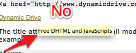
The feature was this: I wanted to have tooltips pop up giving a little more info on the social network site icons.  Not just any yellow standard tool tips. No sir, I wanted custom tooltips. 
No

(None of that standard yellow stuff. Custom or bust.)

I found this article about tooltips with CSS and HTML5. Very nice.  However, when I implemented it, I got my custom tooltip, AND the standard yellow.  Not good.  I then spent a lot of time reading articles and trying different things, working towards perfect tooltips. I learned a lot on the way. 

I learned about the z-index property of CSS.  Basically when items are positioned absolutely, they can overlap.  The z-index controls which come first.  The higher the number the higher they are in the stack.  The items are drawn to the screen in z order from low to high.  So a z-index: 1, would beat a z-index: -1.  

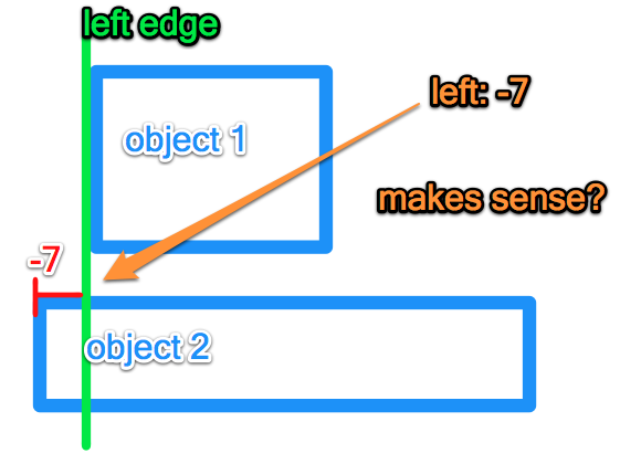
I learned about css positioning.  The key thing I learned was that you can position things using negative pixels. For example left: -7 is what I used to position the object 7 pixels away from the left edge in the negative direction. 
Left_-7

(Here is my very quick visual representation of this phenomenon.)

Yes I had learned these bits of knowledge but my original problem of double tooltips was still lurking.  I kept looking.  I eventually found this article from css-tricks that basically stated "It won't work using a title tag."

I was not to be deterred. I returned to read the original article and…. found the solution. data-tooltip.  HTML5 can have custom data tags.  I made my links a certain class and pulled out the custom data and boom baby.  Custom tooltips. 
Yes

(Beautiful.)

I had avoided this because css doctor says "You shouldn't use data for CSS styling hooks, because if the data is that important, it should be a presented differently."  This is unfortunate because they are right. The tooltip provides a little extra information.  I belongs in the title tag. But this is precisely what causes the double tooltip problem. 

So I have spent an hour working on these tooltips.  I have found a solution, but a nameless faceless standards body says I should not do use the solution.  

So I used it.  A it works wonderfully.  Check it out live here

PS – I think standards are essential and I try to follow them in all the important things.  For example, screen readers would not read my custom tooltips. But they are not essential to navigation which is why I feel this work around is acceptable for now.

My website lives!!!! – sort of.

Screen_shot_2012-05-15_at_9

Today I made some serious progress on ye olde website.  I downloaded the Goldilocks Responsive Boilerplate and went to town.  It is super simple so far, but I like the direction it is going.  

I also started getting my hosting set up. It was quite the beast.  Nameservers, A records etc.  I had to remember some of the stuff I learned in ISYS and I had to Google quite a few things. But it is up.  As in live on the interwebz.  Want to see it? 

The domain name is one I had registered a while ago and just threw up on there.  Drag the window size around and see the responsive smoothness. 

I will keep making improvements to it every day till Friday.  

Image Formats – what, why, and which.

Images are a large part of any website, so I decided to learn more about them today. 

Images come in compressed, uncompressed, and vector format.  A vector format is an image that is drawn every time using math. For example draw a line 45 degree from this point and color it blue.  A non vector image or rasterized image is pixels. Basically the computer has a grid and knows what color each point on the grid should be.  This is why you can zoom in on a vector image forever. The image is redrawn each time so it is perfectly sharp.  You can not zoom into a raster image because the computer only knows what goes in each grid point.  When you zoom in, there are more points than the computer knows what to do with, and so it gets super blocky.  If you ever want to print something big, it usually has to be in a vector format for this exact reason. 

Big_3

PNG, JPEG, and GIF formats are the Big Three image formats. They are the most used formats for displaying images on the internet today. (Try to guess why the formats are matched to the player. 🙂

JPEG – compressed raster – small file sizes, image quality can degrade if edited and saved repeatedly. 
PNG – large file size. Open source successor to GIF. 
GIF – limited to 256 colors.  Useful for simple colors, small file size. 

So the simple rule is, use PNG for everything unless you have a specific reason not too.  This post on Quora about PNG details why. 

So there you have it.  A short post about images.  Anything that I is glaringly wrong or didn't make sense? 

Create – Always learning…

If you haven't seen this video ([youtube http://www.youtube.com/watch?v=RhLlnq5yY7k?wmode=transparent]) watch it.  It is a minute and a half and I always come away having learned something.  

I love to create.  I love to take some raw materials, be they paper, or paint or an idea or words, and fashion it into something that no one has seen before.  I love the idea of seeing a figure in your mind and working with skill and determination until it comes to life. 

I believe that each of us has the opportunity to create amazing things.  A core idea of being a Latter-day Saint is the idea that we are always learning.  I was thinking about the exciting opportunities that decentralized education can provide.  The idea that a farmer in Indiana or India, can get access to the same pool of knowledge as a Stanford student is electrifying.  But what happens when everyone has a college education? Is this a bad thing? The answer is of course, no.  There are so many problems in this world.  We need the creativity and intelligence of everyone to solve them.  We need everyone to create solutions to problems. 

Just imagine if everyone had a great education. Not necessarily a college education, but a great education.  They knew essential and important truths, and could make and test conclusions.  Intelligent and creative people would have the tools and ideas nessisary to work together to attack the big, hard, important problems.  And I think we could solve a fair number of them too.  

Week Review #2

It has been a good week.  My first full week of writing a post every day and I am starting to get the hang of it.  

My computer is still in the shop. It was fixed in one day, but I have been aerating and thatching so many lawns I haven't had time to drive the 1/2 hour over to the mall.  Hopefully Monday.  Then I will start the engines on my site. 

So far this week: 

I asked and answered some questions about web hosting.  

Ask and answered even more questions about web hosting. 

I learned about the history of php

I learned about ftp

And finally I learned about responsive web design

I'd say a pretty good week.  Thanks to all who have read the posts, or encouraged or offered help. It is fun to know that I am not just doing this alone.  You all are awesome. Feel free to message, comment, let me know what I can do to help you, or if a particular topic is interesting to you. Here's to a great week 3!

Responsive Web Design – the new thang

Responsive web design is the new thing.  It is pretty sweet.  Want an example? Go to saltsurf.com and resize your browser window.  Sweet no? 

The whole responsive web design show got its name from Ethan Marcotte in this wonderful article about responsive web design.  He kind of coined a name for a practice that was taking off at the time. 

But how is this black magic accomplished you ask? The secret sauce is media queries. (Don't really read the media queries link. It is long dry and boring. Just read the List Apart article.  Much better. k?) 

Media queries basically ask the device "Hey do you have this?". If the device answers yes, it gets one page. If it says no, it gets another.  Nice right? This does require the developer to think up rules of how they want the page to display. Some responsive websites just get smaller while some completely change menu options and even eliminate or use different pictures. 

Here are some examples:

So if you want to get started making sweet awesome responsive websites, go download a simple boilerplate here -> http://www.getskeleton.com/

And get on it. 

On an aside, I really think that a majority of websites will soon have some of the most important elements of responsive web design.  The device world is breaking apart and you have no idea what size of screen people are going to be seeing your stuff on.  Best to have a prepared response.  (Responsive get it? 🙂


FTP

It’s about to get FTP in here. Today I learned about file transfer. To get your website on your server you need to transmit the bits. FTP is how you do that. First the practical. Cyberduck (http://cyberduck.ch/) is widely regarded as the best free Mac FTP tool. Download it, try it out. Theoretical – I hear quite a few devs use Dropbox to sync their server files and their development files. Which is actually really smart. When you want to add a file to your server, just drag it into the Dropbox file. After reading up on it, it has limitations. You are limited to HTML and client side scripts or complete access to the server. Might be fun to try. On another note I get my computer back from the Apple Store tomorrow. My trackpad if fixed and we are ready to roll.

History of php

Php is awesome. I have been learning about it as I build my webpage. It was created in 1995 by one guy, Rasmus Ledorf. He wrote a set of scripts to run his own webpage. That’s why php stands for “Personal Home Page”. He released the scripts and they have become php today. That is inspiring. To think that something you create to help yourself would eventually be installed on 20 million websites. PS – see the Avengers. It is awesome.