I spent just as much time implementing a small feature today, as I took yesterday to build the whole website. Sheesh. 🙂
The feature was this: I wanted to have tooltips pop up giving a little more info on the social network site icons. Not just any yellow standard tool tips. No sir, I wanted custom tooltips.
(None of that standard yellow stuff. Custom or bust.)
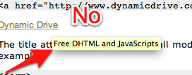
I found this article about tooltips with CSS and HTML5. Very nice. However, when I implemented it, I got my custom tooltip, AND the standard yellow. Not good. I then spent a lot of time reading articles and trying different things, working towards perfect tooltips. I learned a lot on the way.
I learned about the z-index property of CSS. Basically when items are positioned absolutely, they can overlap. The z-index controls which come first. The higher the number the higher they are in the stack. The items are drawn to the screen in z order from low to high. So a z-index: 1, would beat a z-index: -1.
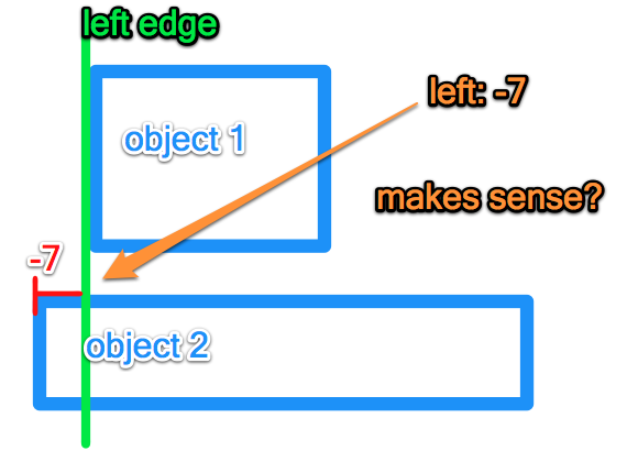
I learned about css positioning. The key thing I learned was that you can position things using negative pixels. For example left: -7 is what I used to position the object 7 pixels away from the left edge in the negative direction.
(Here is my very quick visual representation of this phenomenon.)
Yes I had learned these bits of knowledge but my original problem of double tooltips was still lurking. I kept looking. I eventually found this article from css-tricks that basically stated "It won't work using a title tag."
I was not to be deterred. I returned to read the original article and…. found the solution. data-tooltip. HTML5 can have custom data tags. I made my links a certain class and pulled out the custom data and boom baby. Custom tooltips.
(Beautiful.)
I had avoided this because css doctor says "You shouldn't use data for CSS styling hooks, because if the data is that important, it should be a presented differently." This is unfortunate because they are right. The tooltip provides a little extra information. I belongs in the title tag. But this is precisely what causes the double tooltip problem.
So I have spent an hour working on these tooltips. I have found a solution, but a nameless faceless standards body says I should not do use the solution.
So I used it. A it works wonderfully. Check it out live here.
PS – I think standards are essential and I try to follow them in all the important things. For example, screen readers would not read my custom tooltips. But they are not essential to navigation which is why I feel this work around is acceptable for now.


Great find with the tool tips! I think I was going to implement tool tips at one point and then got distracted and forgot to go back and figure it out. Thanks for figuring it out and sharing.